Monday 17 December 2012

Before and after: Adjusted climate graphs


Before and after 2011- this of course vastly altered the world temperature as a result as well.

 Blue- before. Red- after.

The black line added to it is the way they made a flat average (green) slope up (red).

Here, the IPCC took the soviet-style method of rewriting history. They took their own data and sat on it, squashing a clearly warmer period known throughout written and physical historic records (plants, wine growing etc), although every book written before then also still contains it. Like this one:


What does this say about the proxy and other past records we used before they did (which were also the basis of the IPCC's very existence?).


More naughtiness from Australia

And New Zealand

You can also drop the left rather than raise the right, the result is exactly the same.
And in Austria, blue, flat, red, rises.

Form of individual corrections applied by NOAA. The black line is the adjustment for time of observation. The red line is for a change in maximum/minimum thermometers used. The yellow line is for changes in station siting. The pale blue line is for filling in missing data from individual station records. The purple line is for UHI effects (this correction is now removed).


Rather than showing two sets (before and after) this red line was the actual hockey stick of extra heat added by the USHCN. It's as if they were all under some kind of instructions to do so. The details of how they got the total are above:
Alabama, 1F in a century, all artificial

Now looking at this motley collection, what do they all have in common? Yes, they all started flat and sloped up. Don't ask why, no one knows. Feed it all into the global set and what happens to it? As above, so below, these alterations done at the local level are all collected together and form the ones we have our policies made with, although if you take the adjustments away in reverse it won't have a hockey stick at all.
 
Update. In 2020 an Australian senator carried out an enquiry and the BOM were unable to explain the national adjustments in 2011 https://gerardrennick.com.au/media-release-bom-refuses-to-answer-on-data-records/


Friday 14 December 2012

Read the sea level

Tuvalu has been campaigning for compensation from the west for rising sea levels caused by their CO2 emissions, as many other Pacific islands. Sea level is like temperature, in that it is not constant but varies from place to place, just less over a short period. But it's roughly averaged, and while James Hansen is the sea's hockey stick advocate, his rises are all in his very confused mind, many yards by 2100.

There are two causes of sea level from rising temperatures, melting ice and thermal expansion, which are roughly equal. But without the temperature rise the sea will do nothing. Then a small bounce back from the loss of ice from the ice age adds a little more. Local differences are also down to tectonic plates, so Britain is tilting so one side will go higher and the other lower. Likewise many low lying islands are on a tectonic plate which is falling, but that of course is independent of the temperature. But (although they are not entirely reliable are many times more consistent than the comparable temperature records as seen in my previous entry) local sea levels are pretty easy to follow as you only basically need a man with a pole and a tape measure and far harder to cheat. Satellites do it as well now, tide gauges/bobs and are then collected and added to get the world averages per year. But as local levels can only cause local disasters here is Tuvalu's. Where is the cause of the reason they are demanding our money again?

Realistically it is relatively easy to work out the available water from ice, and extremely easy from heat. The amount required to melt is also temperature based, with a delay as the latent heat required to melt huge glaciers takes some decades before an above freezing temperature will finally melt. Meanwhile back in the present the sea is rising since the last little ice age. These coincide with solar minimums throughout history, and then return to typical averages before the next one. So we are always between one or the other, so the temperature and sea levels always rise or fall in tandem, they are never static. Seven inches is a reasonably safe rise, which we experienced in the last century, and if the temperature rose then the expansion would be fast, with a delay for the ice which would gradually follow. The progress is far closer to linear than temperature as driven by so few causes, and by 2012 that trend has continued, and unlike temperature needs an awful lot more to happen for it to rise sharply. That will make it a lot easier to project than the rest of the climate as it takes a lot to change it, and can only rise quickly after an ice age ends. After the sharp rise following an ice age it slows down to zero, and then falls again once the temperature does. It always has and always will.

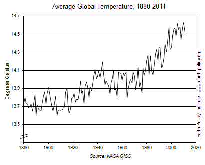
The sharp rises are when the ice ages end, and can see they are regular cycles, and the temperature also rises sharply every so often, we are looking at millions of years and those patterns are both pretty regular and impossible to have human influence. Putting temperature and sea level rises into historical context is something never seen in the IPCC driven publications, as once you see how minor today's changes are everyone would pack up and go home. So far only handfuls of people come here and see it, but the material's there and should have the same effect. The red temperature diagram has swings of almost 10C, which the planet and any life upon it survived enough to maintain a healthy mix of plants and animals. Unlike other animals mankind has the gift of foresight, and the geological periods it takes for sea level alone to rise give us centuries to plan. The reason people live on coastlines near sea level and flood plains is mainly due to overpopulation and ignorance, as despite regular floods simply as the tides are sufficient to inundate New Orleans, most of Bangladesh and The Netherlands, the simple vast rise in population (which is a hockey stick and rising even more sharply each decade, and totally genuine) forces people to unsuitable land, and then to blame ourselves (we all emit CO2, it's called breathing) and try to punish everyone else to compensate them for choosing to live in a fucking idiotic place is no less than extortion.

Bottom line, you can check yourselves, the land ice (Arctic ice can't cause the rise as only Greenland contains the stuff which can and that's not likely to melt in our lifetimes, so is irrelevant), and 90% is in Antarctica which is steadily growing. If Antarctica continues to grow, without a vast and sudden melt of the Greenland glacier there is nothing there to cause a rise. Where could it come from? And for the thermal expansion you'd need (I'm sure the equation is around) a temperature rise so much beyond anything currently possible it isn't worth considering. What's the point of thinking about something which both isn't happening and whatever the Hansens of this world are spouting are almost impossible, not because of individual opinions but current and historical data. Plus the prediction of long term temperature trends beyond the huge thousands of year ice age cycles are impossible as they are chaotic. And before anyone blames CO2 the 33C greenhouse effect the UN use has 1C from CO2, which would double if it doubles unless it has positive feedback. It has increased 50% already, and the attributed rise from 0.7C was 0.4, less than expected. There are no new phenomena to cause a delayed or surprise feedback, it was never expected to be, it is either there or not, and with that experiment half run observation tells you what exactly?

Thursday 13 December 2012

Thermometer nurse!

Imagine you are in the standard hospital ward, and each patient has the temperature chart at the end of the bed. You give them a thermometer, note the amount and write it on a graph so you can see the progress. But what if the patient was a planet, and had a pair of measurements as well? That means first you get the global mean temperature, and because taking the temperature of a planet is infinitely harder than a person (some claim impossible) they use the anomaly, the change over a period, so you can iron out any gaps and errors, supposedly.

So here is the global temperature from 1880-2012, you can clearly see the el nino peak in 2010 is higher than in 1998. But the short term diagram below it for the recent period covering them both (nb global temperature in degrees so comparing like with like) is clearly lower.

A closer look, no, still not there.

 The diagram above clearly shows the anomaly in 2010 as higher than 1998

But this one for the same period isn't quite sure. Look at the final 20 years on both.


Where's it gone now?

Still not there

If I can find close up short term diagrams for both I will add them as well, but the detail on each is quite clear enough to see the 1998-2010 peaks on both the observed temperatures and anomalies. In both you see it is higher in one and lower in the other. In both cases. Imagine the hospital ward again, while each nurse in attendance has their own temperature diagrams per patient, and the doctor has to read one with a peak on Tuesday while another is on Thursday. What is he supposed to do?
An animated comparison with explanation

Maybe this could explain part of it?

Taken from here GWPF.org This is not an isolated cherry pick, quite the opposite. On my long climate post here I have a series of links showing many of these, in fact wherever you can gain the original data before adjustment the same pattern appears habitually. That would be the equivalent of the nurse putting the thermometer in a cup of tea after leaving the patient each time. Then what would the doctor think?

My own conclusions, based purely on the laws of logic, tell me this. Firstly, if a building has dubious foundations, how can it be trusted? Imagine any other profession having such differences in its methods of measurements and results. If an engineer had three different sets of conflicting figures for a bridge, I wouldn't walk across it, let alone drive over it, yet they base world taxation policies solely on a group of self-interested lackeys whose very career relies on a positive result, who in any other field would be answering questions at the local nick. Secondly, these alterations for 1998, and 1934 and the entire medieval warm period before it, do not imply, but express the fact that if they needed to adjust the past temperatures down they had measured them wrong AND kept using them for many years before apparently discovering it and 'fixing' them. And oddly, if you are given the wrong change in a shop by accident all errors will even out to zero over time, but every single change here has made the past cooler and the present warmer. Only a mother or son could look at that scenario and still trust it.

This is from NASA, although possibly for the US as they have the most stations it is quite a fair sample. 1934 was the hottest year. And 1998 is still above 2010. NASA figures corrected


Monday 10 December 2012

Avoidable policies

I have worked out something everyone needs to know and apply when it comes to their country's political problems, some you are stuck with by bad luck, and some are avoidable, or to look from the politician's side, deliberate.

This simply means when some people are put in the utter shit, often the poorest and least able to fight back, it was done to them deliberately.

I will give a few very simple examples, and with them should easily be able to recognise the same principle elsewhere, and see basically (language alert) what total fucking bastards the people are who made them. Here are some doozies:

1) Low interest rates: Max Keiser has just given the exact figures of winners and losers from low interest rates, twice as many people lose than win. That is because for all the money saved by mortgage holders, twice as many pensioners and investors lose, thus shrinking the economy, deliberately.

I will add something he didn't, ie high interest rates put house prices down for new buyers, so more people gain by them as they pay less in the first place. Sellers never lose as most trade up and spend less overall as the discount on what they are buying will usually be bigger than the nominal loss they are taking, which is almost guaranteed not to be a loss as the prices almost always go up, just not quite as much.

2) High energy prices: In Britain we have no energy price caps or regulations. No, none at all. The continent do, so as the companies there (gas and electricity are monopolies as there is only one supply, however many 'suppliers', just like the railways) have limited profits they have bought all ours and charge as much as they can before too many people would default. That is avoidable as the rest of the continent avoids it with regulations.

3) The Euro: Greece could recover if allowed to devalue their currency, that has never been in dispute, but besides the residents not understanding enough about economics (how many voters do?) to campaign to leave, they could be released from it, but instead will revert to a third world country as had they left through bankruptcy it may have destabilised the ambitions of a united Europe, which is little different from what Hitler wanted to create. Or possibly Mussolini. Therefore everything has been shifted in order to siphon money and policies to guarantee Greece's debts, while they suffer unnecessarily as they don't get the money, it just services their existing debt directly. Of course the debts wouldn't evaporate if they left the Euro, so that is barely a consideration. In fact they would be better off, probably leading to lower interest payments and a better chance of paying them.

4) The Common Agricultural Policy: The Common Market is based on price fixing, which is illegal for private businesses. They burn and bury food annually simply to keep the prices up. That is a crime against the people.

5) Green taxes: The British/EU (there is little difference now) green taxes mean the already record energy prices are expected to double in a decade, rising to an average of £2,500 a year. Of course (plus petrol) besides stoking inflation as everything manufactured and transported uses energy so has to be factored into the price, hits the poorest the most as they pay the same for it all but is more of their total income. Only poor people die of cold, 3,000 people a year in Britain. Totally deliberate.

Now you have some examples, you are probably voting these bastards in. Why do I say that? Well, in Britain ALL THREE MAJOR PARTIES almost totally agree on these policies, so if you vote for them they will continue. They won't get us out of the EU, or repeal the green taxes, or regulate foreign energy companies, so in the end they have not done this but if you voted for them you have. Every single Labour, Conservative and LibDem voter has chosen these policies. You don't have to. UKIP are an escape route, you only need one alternative as more would dilute the vote and keep them out. I'm not recommending any party personally, but explaining what you get depending who you pick. The same is applicable worldwide, as even if there's a tiny party offering an alternative, if you vote for them they will get in. You can't be screwed in a democracy more than a 5 year term if you vote them out. That's our only power at the moment unless we are given referendums on more policies, which we clearly won't. Don't blame them, blame yourself.         

Sunday 9 December 2012

(Copied) The green agenda

Having read this on another blog it was so clearly set out I have copied it over. I can see it, he can see it, and many others can, but a tiny minority of the total. Meanwhile the average Joe, who trusts authority and rarely if ever (despite the arrival of the internet) checks what they are told, so are also used to slap down any opposition to the collective reality. But they can't keep it up forever.

tckev on said:
Perhaps the powers that be would be just a little more subtle. Perhaps we are being softened-up.
1. Get the majority to believe in some fictitious coming calamity. Say, CO2 causes excess global warming.
2. Propagandize the coming misfortune of many people worldwide – ensure your population feels very guilty about their perceived misuse of fossil fuels.
3. Remove, as far as possible, all industries perceived as misusing fossil fuels, and replace them with inadequate systems that will ensure all prices rise, especially the price of fuel – all fuel. Impose ever more onerous restrictions on import and use of fossil fuels.
4. As global temperatures fall keep propagandize the local hot spots. Ensure every unusual weather event, be it wet, cold, stormy, calm, dusty, or hot gets blanket coverage on all media and ensure that the rise in CO2 get mention each time. Give the whole event a catchy name – say Climate Change.
5. As transportation, food, and health requirements get more expensive and very difficult to maintain, the government, the well connected, and the rich and powerful just have to wait. About every 10-12 years there is a very cold weather, sooner or later (about 100 year – it’s about due) a flu pandemic will come around and decimate the population. In the meantime add more burdens to the ordinary person – restrictions of travel, local no go areas, food shortages, etc.
The government of the day just has to sit on its hands and wait. As each small calamity occurs few people notice how many have succumbed; we’re all too busy trying to stay fit and healthy. By the time it’s too late the government explains that it would be wrong to allow burning fossil fuel, after-all they have signed treaties and made promises to the rest of the world not to.

Sunday 2 December 2012

It speaks for itself

In law, there is a term which means the evidence is so clear it speaks for itself. Like this:


This study, where the correlation (unlike CO2) is so close it overshadows all lesser evidence, is from 2001, 11 years ago. Why hasn't anyone found it apart from a few of us online? Further studies have confirmed this to be the case, so why does the fraud continue, while the obvious cause of temperature variations is right in front of them? As David Icke says, follow the money. But you've read this so you know different now, pass it on until everyone else does as well.