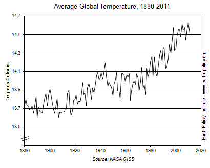
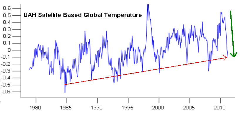
So here is the global temperature from 1880-2012, you can clearly see the el nino peak in 2010 is higher than in 1998. But the short term diagram below it for the recent period covering them both (nb global temperature in degrees so comparing like with like) is clearly lower.

A closer look, no, still not there.


If I can find close up short term diagrams for both I will add them as well, but the detail on each is quite clear enough to see the 1998-2010 peaks on both the observed temperatures and anomalies. In both you see it is higher in one and lower in the other. In both cases. Imagine the hospital ward again, while each nurse in attendance has their own temperature diagrams per patient, and the doctor has to read one with a peak on Tuesday while another is on Thursday. What is he supposed to do?
An animated comparison with explanation
Maybe this could explain part of it?

My own conclusions, based purely on the laws of logic, tell me this. Firstly, if a building has dubious foundations, how can it be trusted? Imagine any other profession having such differences in its methods of measurements and results. If an engineer had three different sets of conflicting figures for a bridge, I wouldn't walk across it, let alone drive over it, yet they base world taxation policies solely on a group of self-interested lackeys whose very career relies on a positive result, who in any other field would be answering questions at the local nick. Secondly, these alterations for 1998, and 1934 and the entire medieval warm period before it, do not imply, but express the fact that if they needed to adjust the past temperatures down they had measured them wrong AND kept using them for many years before apparently discovering it and 'fixing' them. And oddly, if you are given the wrong change in a shop by accident all errors will even out to zero over time, but every single change here has made the past cooler and the present warmer. Only a mother or son could look at that scenario and still trust it.
This is from NASA, although possibly for the US as they have the most stations it is quite a fair sample. 1934 was the hottest year. And 1998 is still above 2010. NASA figures corrected
From last few many years there are many changes that happens in the technology and the latest Thermometer comes in the market which are very helpful for the patient as well as doctors.
ReplyDeleteIf the nurses made the same errors and alterations and the climate crooks half the patients would be dead.
ReplyDelete